Rescue a Meal Today!


Problem Statement
Budget-conscious young adults find it hard to find affordable food delivery options given rising food prices and high delivery fees at after-work hours, while F&B businesses lack a efficient way to deal with food surplus.
Our Solution
Food Hero bridges the gap between budget-conscious young adults and F&B businesses by providing a mobile app that offers affordable and convenient access to surplus food. Our app is designed to achieve three key objectives:
-
Affordable Dining Solutions: Enable young adults to discover and purchase surplus food from local F&B businesses at significantly reduced prices, making after-work and late-night meals more budget-friendly.
-
Minimise Food Waste: Equip F&B businesses with an efficient platform to manage and sell surplus food, helping to reduce waste while maximising their revenue potential.
-
Seamless User Experience: Deliver a user-friendly interface that allows users to effortlessly browse, order, and enjoy delicious meals, all while promoting sustainable eating habits.
User Research
Target User Group Identification
Identified 2 potential target user groups for our problem.
Online Survey
Gathered quantitative data through the distribution of an online survey
Primary Group: Budget-Conscious Young Working Adults and Students
This group primarily consists of young professionals and students aged 18-35 who are often juggling work, studies, and social commitments.
-
They are tech-savvy and rely on mobile apps for convenience in their daily lives. With limited disposable income, they seek affordable and safe food options that fit their busy lifestyles.
-
Food Hero can provide a convenient solution by delivering surplus food directly to their doorstep, offering a cost-effective alternative to traditional meal options. By choosing surplus food, they not only save money but also contribute to reducing food waste.
Secondary Group: F&B Businesses (Restaurants, Eateries, Bakeries)
This group includes small to medium-sized food and beverage establishments, such as local restaurants, cafes, and bakeries.
-
These businesses often face challenges with food surplus and waste management.
-
By utilising Food Hero, they gain access to a seamless and profitable platform for selling surplus food, enabling them to efficiently recover costs from unsold stock. By participating, businesses can enhance their sustainability efforts while reaching a broader customer base.
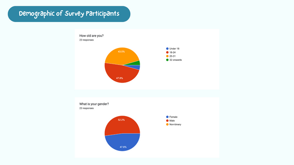
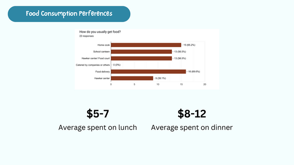
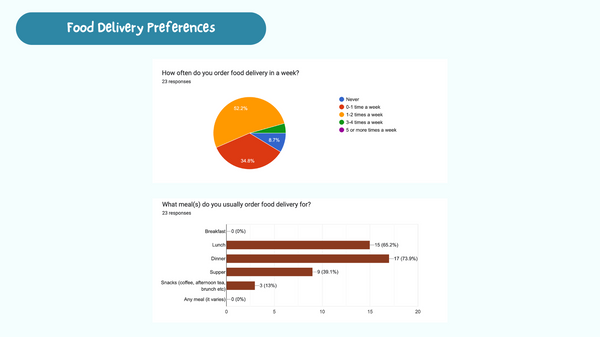
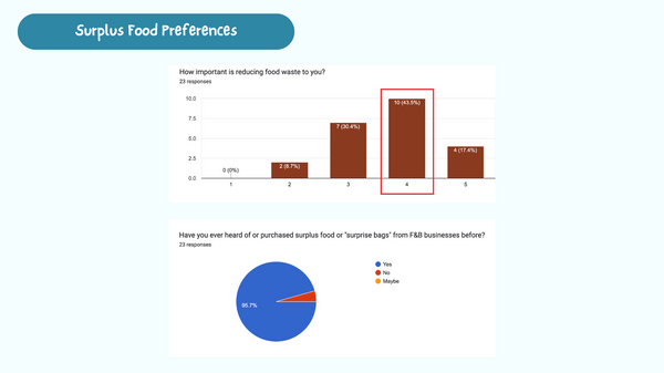
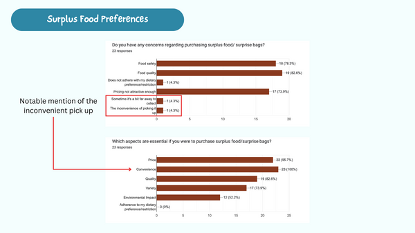
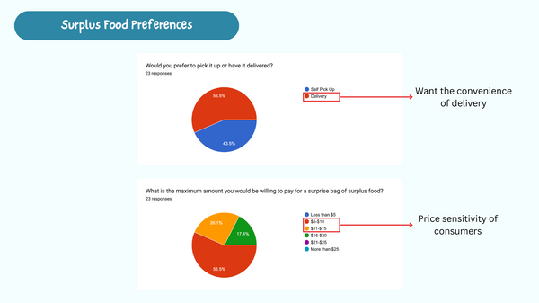
We employed a two-part approach, starting with an online mass survey to gather quantitative data from our target user groups. The survey included questions about food preferences, spending habits, and attitudes toward surplus food. We received a total of 23 responses, which provided valuable insights into user needs and preferences. The following are the results obtained.


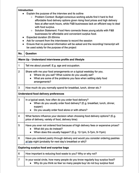
Semi-Structured Interviews
Conducted a mixed of online and in-person interviews for qualitative insights
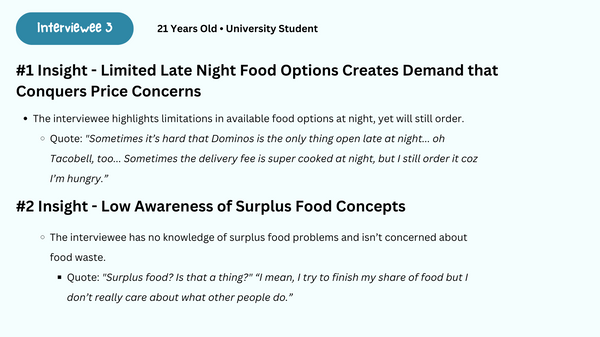
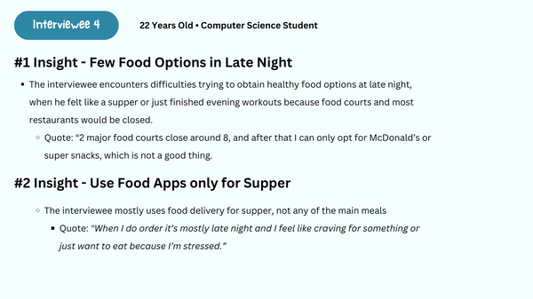
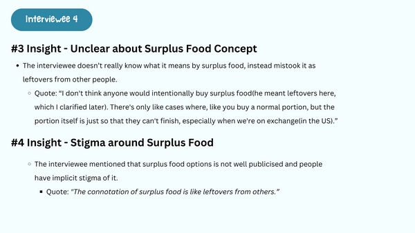
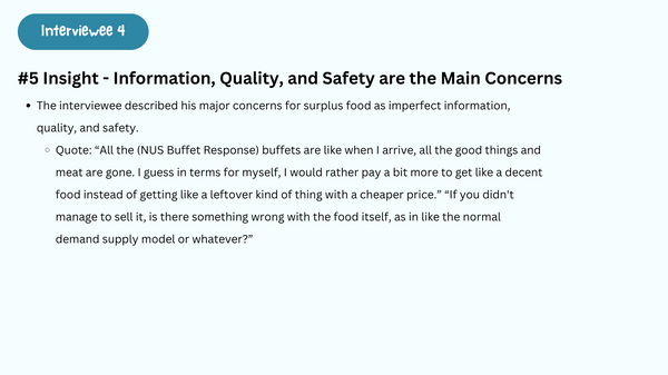
Following the survey, we conducted in-depth semi-structured interviews to gather qualitative insights. A total of 4 interviewees participated in these conversations, allowing us to explore their experiences, challenges, and expectations regarding food delivery and surplus options in greater detail. This qualitative data enriched our understanding of user motivations and pain points, informing the design of the Food Hero app.
The following are our interview guide and summarised insights from each interviewee, as well as a consolidated comparison of overlapping themes.


Data Analysis
After collecting and reviewing the data from our online survey and interviews, we conducted a thorough analysis to extract meaningful insights. This process involved creating an affinity diagram to organise and categorise the feedback, allowing us to identify key themes and patterns. From this analysis, we developed two user personas along with their individual user journey maps. Below is a FigJam board consisting of the artefacts. (https://www.figma.com/board/F19a1hLaPGanHEwltioXN8/Data-Analysis?t=S940tE815lVp4dka-1)
Key User Tasks
Based on our data analysis, we found that our primary users seek a convenient and efficient way to access affordable surplus food options. Users have expressed the need for a straightforward method to discover nearby food offerings, understand what they are purchasing, and manage their orders seamlessly. These findings align with the insights gathered from our user personas and journey maps. This gives rise to our three overarching goals:
-
To facilitate easy discovery of surplus food options by allowing users to search and select based on food variety and delivery prices.
-
To provide comprehensive information about stores and surprise bags so users can make informed decisions about their purchases.
-
To streamline the ordering and delivery process while enabling users to provide feedback post-delivery, enhancing their overall experience.
With users' needs and goals in mind, we identified 3 key user tasks:
-
Surprise Bag Discovery: Users need to discover nearby surplus food options by searching and selecting based on food variety and delivery prices.
-
Store & Surprise Bag Details: Users need to find out more information about the store and what the surprise bag may contain.
-
Order, Delivery & Feedback: Users need to place their order, track the delivery in real time, and perform post-delivery actions.
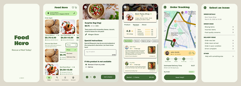
Prototype
Design
We focused on translating our insights and user needs into tangible design solutions. This involved creating a series of low-fidelity wireframes to explore layout and functionality, followed by high-fidelity prototypes that brought our vision to life with detailed visuals and interactive elements.
Through multiple iterations, we refined the design based on user feedback and heuristic testing, ensuring that the final prototypes effectively addressed the identified user tasks and enhanced the overall user experience.
Wireframes
Following the identification of the 3 key user tasks, we began by developing low-fidelity wireframes to visualise the app's structure and functionality. Each team member focused on 1 task, creating wireframes that reflected their individual design perspectives.
Once completed, we convened to evaluate our collective wireframes internally. This collaborative review allowed us to refine our ideas and ensure that the wireframes effectively addressed user needs.
We also received feedback from 4 users regarding the wireframe and annotated them as Figma comments. A summary of the feedback includes:
-
Clarity and Labelling: Users were confused about whether the shop card represents one shop or one surprise bag due to the price indicator. Clearer labelling is needed.
-
UI Layout Improvements: Excessive spacing on the right side of the card and the map on the home page taking up valuable space were noted. A more balanced layout and reconsideration of the map's utility are recommended.
-
Button Functionality: The preview button was perceived as a tag rather than a functional button.
-
Enhanced Information Display: Users requested the addition of an "About" tab for restaurants and the inclusion of restaurant names and locations on the basket page for better clarity.
-
Communication Features: A suggestion was made to include a button for users to contact the driver, enhancing communication and user experience.
Link to wireframe:
https://www.figma.com/design/bLZv1UmEZalzHkqeKi3Z2k/Wireframe?node-id=2202-3455&t=CZpjaPMilMGq83SW-1
Design Choices
At this phase of lo-fi wireframe evaluation, we decided to adopt and drop some features in the application.
1. Clarified Shop Representation
Each shop card will clearly represent a single shop selling surplus food, with a visible price range for food items to enhance user understanding of offerings.
2. Revised Map Functionality
The map feature will be shifted to a separate page dedicated to helping users find the nearest shops selling surplus food, streamlining the home page and improving usability.
3. Enhanced Interaction and Information
A modal will be displayed instead when users click on an item, aligning with their mental model. Additionally, the basket page will include the restaurant name and location, along with an "About" tab indicating the shop's certification as a partner of Food Hero.
After reviewing our individual wireframes, we moved on to complete our high-fidelity prototypes and conducted usability testing. Below is the consolidation of our individual high-fidelity prototypes.
Usability Testing
We performed usability testing with a total of 4 individuals. They were tasked to perform the 3 tasks we have previously defined, and answer a couple of questions regarding the user experience of using the prototype.
Our findings can be summarised below:

Icon Interactivity and Consistency
Users expected certain icons to be clickable, indicating a need for clearer visual cues to denote interactivity. Additionally, there was a suggestion to maintain consistent font styles across different pages to enhance the overall coherence of the app.

Clarity in Features and Options
Feedback indicated that users were unsure about the distinction between 'best deals' and 'nearest to me,' highlighting the need for clearer differentiation between categories.

Navigation and Checkout Confusion
Users found it confusing to encounter a different checkout page with a varying subtotal. They also suggest that payment options could be integrated into the final page to reduce the number of clicks required to reach order confirmation.
Error Prevention and User Control
Users suggested implementing features such as a confirmation screen when deleting notifications and a character limit for text inputs to avoid system errors.
We conducted a Heuristic Evaluation of our prototype, comparing it to the 10 Nielsen Heuristics to assess usability. Upon discussion, we have identified and highlighted the following heuristics:
User Freedom
The side menu, which serves as a primary navigation tool, is only accessible from the home screen at the top left corner. This design choice restricts users' ability to navigate freely across different pages of the app.
As a result, users often found themselves needing to perform multiple back clicks to return to the home screen in order to access the side menu. This limitation can lead to frustration and a sense of being trapped within a linear navigation flow, ultimately hindering the overall user experience.
Design Choices
Following our Heuristic Evaluation and Usability Testing, we took a critical look at user feedback to refine our high-fidelity prototype. Our primary focus was on enhancing the three key user tasks and improving context understanding within the app. Here are the 3 main changes made to the prototype design:
1. Transition from Side Menu Navigation to Bottom Navigation Bar
To improve accessibility and streamline navigation, we replaced the side menu with a bottom navigation bar. This change allows users to easily access key sections of the app from any screen, reducing the need for excessive back clicks and enhancing overall usability. The bottom navigation bar aligns with common design practices in mobile applications, making it more intuitive for users.
2. Merging Shopping Cart and Payment Checkout Pages
In response to user feedback regarding the number of clicks required to complete an order, we merged the shopping cart and payment checkout pages. This design choice not only reduces the number of steps in the ordering process but also aligns with the design conventions of most food delivery apps. By streamlining this flow, we aim to create a more efficient and user-friendly experience that encourages users to complete their purchases with ease.
3. Replacing Surprise Bag Preview Modal with an Additional Screen for Individual Food Items
To enhance the user experience when exploring food options, we replaced the surprise bag preview modal with a dedicated screen for each food item in the shop. This change allows users to view detailed information about individual items, including descriptions, images, and pricing, without the constraints of a modal window. By providing a more comprehensive view, users can make informed decisions about their purchases, ultimately improving satisfaction and engagement.
Final Prototype
After incorporating the feedback from our usability testing and heuristic evaluations, we've reached the final version of the prototype!
We are proud of the improvements made, which empower users to navigate the app with ease and confidence. This prototype represents not just our individual contributions, but a shared commitment to creating an engaging and intuitive food ordering experience.